Why a Dashboard?
Until now, getting a complete picture of a ticker on SeasonAlpha meant clicking through five to ten analysis pages: annual cycle, monthly cycle, drawdown, strategies, upcoming events. Each page has its strengths — but none shows everything at a glance.
That is exactly what the new Dashboard at seasonalpha.ai/dashboard changes. You enter a ticker, and within two to three seconds everything is in front of you: AI Score, crash signal, seasonality, risk, top strategies and the next events — all calculated specifically for that ticker.
What you get on one page
The Dashboard is built as a Bento Grid: eleven compact cards, each with its own message. You don't need to expand anything or apply filters — everything is immediately visible.
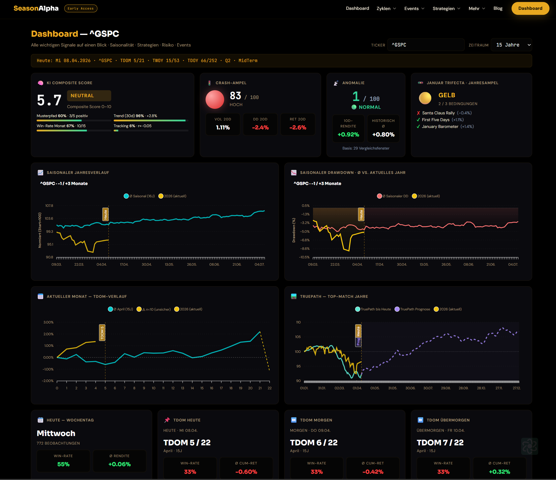
The Hero Row: four signals, one second
At the very top you see four cards that together deliver a realistic health check for the selected ticker:
- AI Composite Score (0–10) — four sub-scores are combined into a single value: how well the historically matching years performed, what the projected 30-day trend looks like, what the win rate of the current month is, and how closely the current price path follows the seasonal norm. Above 6.5 = Bullish, below 3.5 = Bearish, in between = Neutral.
- Crash Signal — three risk features (20-day volatility, 20-day drawdown, 20-day return) are percentile-ranked against the last 252 trading days of the same ticker. The result is a risk score 0–100 with a green/yellow/red signal.
- Anomaly Radar — compares the current 10-day return with the historical average across all comparable windows. When the value lies far outside the norm, that is a signal to take a closer look.
- January Trifecta — shows the status of the three January indicators for the selected ticker (Santa Claus Rally, First Five Days, January Barometer). Three hits = green, two = yellow, fewer = red.
The Charts: seasonality at a glance
Directly below you see four charts in two rows:
- Seasonal Annual Cycle — the average trajectory of the last 15 years, with the current year shown in gold alongside it and a today-marker drawn in. You can immediately see whether the year is running according to the seasonal plan or deviating from it.
- Seasonal Drawdown — the other side of the coin: where has the maximum risk historically been at each phase of the year, and how deep is the current drawdown in comparison.
- Current Month (TDOM Curve) — a zoom into the current month: average performance per trading day, with the running month and a "today" marker overlaid.
- TruePath — we search for the five historically most similar annual trajectories and project a forward forecast for the next 60 days from them. This is not a crystal ball but pattern recognition across 100+ years of data.
Weekday and TDOM Quick Checks
Four mini-cards show the win rate and average return for:
- Today (weekday) — Example: the S&P 500 rises on Wednesdays in 55% of cases, average +0.06%.
- TDOM today / tomorrow / day after tomorrow — the next three trading days as TDoM positions, with historical win rate and average return.
This tells you not only where you stand seasonally, but also what the next three sessions have historically meant.
Two-Week Phase: where are we in the 2-week cycle
A wide card shows all 24 half-month phases (Jan H1, Jan H2, …, Dec H2) as a bar chart, with the current phase highlighted in gold. Next to it: status (Bullish / Neutral / Bearish), average return and rank within the 24 phases.
Example S&P 500 for Apr H1: avg +0.24%, status Neutral, rank 17/24 — a rather unremarkable half-month.
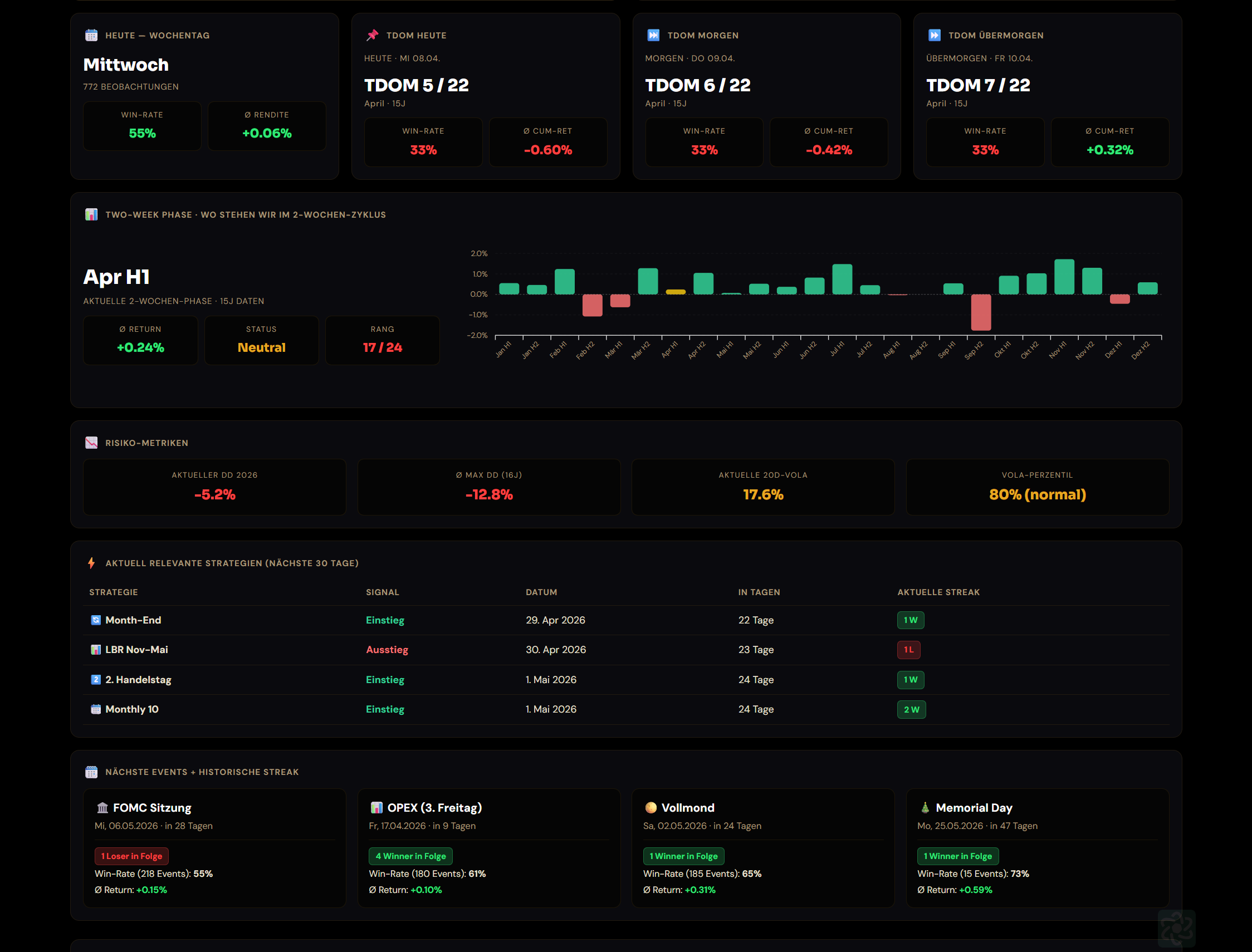
Directly below, on the same screenshot, you can see the other cards shown in the example: the four risk KPIs, the top-strategies table with streak badges, and the four event cards — which we will look at in detail next.
Risk: four KPIs, one truth
A risk card with four KPIs:
- Current DD in the running year
- Avg Max DD of the last 16 years
- Current 20-day volatility
- Volatility percentile (where the current volatility stands relative to its own history)
This tells you not only whether the market is risky, but how risky it is for this ticker compared to its own history.
Top 5 Strategies with a Signal in the Next 30 Days
Of the 22 Plain Vanilla strategies, only those with an entry signal in the next 30 days are shown, sorted by date. For each strategy you see the historical win rate, the next signal date and the current streak (e.g. "3 Wins" or "5 Losses"). At a glance you know which setups are becoming active soon — without having to click through all the strategies.
Next Events with Historical Statistics
Four cards for the next upcoming events:
- FOMC meeting (Fed interest rate decision)
- OPEX (3rd Friday of the month)
- Full moon / New moon
- Next holiday
For each event you see how the selected ticker has historically reacted in a t−3 to t+3 window: win rate, average return and the current streak. This turns "the Fed meeting is next week" into a real, ticker-specific expectation.
What is the Dashboard not designed for?
To be transparent: the Dashboard is an overview, not a backtest and not a recommendation. If you are actually trading a setup, you will want to switch to the relevant detail page (Plain Vanilla, Backtest Engine, Annual Cycle) and go deeper there. The Dashboard tells you: "This is worth a closer look right now." The detail pages tell you how to look closer.
We are also transparent about the limitations:
- The AI Score sub-scores are pragmatic and calculated client-side — no magic involved.
- For crypto tickers, FOMC, OPEX and holidays are logically absent.
- The Trifecta was designed for US indices but can also be applied to individual stocks — with the appropriate statistical caution.
How to use it
- Go to seasonalpha.ai/dashboard.
- Type in a ticker (e.g.
^GSPC,TSLA,BTC-USD,^GDAXI). - Choose the time range (default 15 years — for crypto prefer 5 years).
- Read the four hero cards from left to right: AI Score → Crash Signal → Anomaly → Trifecta. That is your 5-second assessment.
- If something specific interests you, click the matching detail page in the header menu (Annual Cycle, Plain Vanilla, Backtest Engine, …).
You can also call the Dashboard directly with a ticker:
`
https://seasonalpha.ai/dashboard?t=TSLA
`
What we are building next
On the roadmap:
- Ticker comparison — two tickers side by side in the Dashboard
- Custom watchlists — your own ticker lists with a saved Dashboard view
- Alerts — notifications when the AI Score, crash signal or strategy signals cross a threshold
Until then: try out the Dashboard, tell us what is missing, and if you like the idea — subscribe to the newsletter below to hear about every new feature first.