Is option premium expensive or cheap right now?
That single question decides whether you lean toward selling or buying options — and you cannot answer it from the raw IV number. Implied volatility of 20% is high for a sleepy index and low for a growth stock. The vol regime radar on /skew fixes this by framing every ticker relative to its own history, along two axes: risk reversal rank and IV rank or IV percentile.
This article walks through the three building blocks — risk reversal, IV rank and IV percentile — why rank and percentile are not the same, and how to read the radar as four quadrants.
What is a risk reversal?
A risk reversal (RR) measures the tilt of implied volatility between puts and calls. Concretely, we take the IV of an out-of-the-money call (25 delta) minus the IV of an out-of-the-money put (25 delta):
RR = 25Δ call IV − 25Δ put IV
The sign reveals the mood of the options market:
- Negative RR (put skew): puts are more expensive than calls. Traders pay up for downside protection — the classic fear pattern of equity indices.
- Positive RR (call skew): calls are more expensive than puts. That signals upside speculation or squeeze appetite and shows up more often in single momentum stocks or commodities.
Some providers flip the sign and quote skew = put IV − call IV; it is the same metric. The risk reversal is the industry-standard skew measure because it packs supply and demand for protection into a single number.
IV rank versus IV percentile — the difference that matters
The second building block asks how expensive volatility is right now within its own history. Two metrics do this, and they are often confused.
IV rank: where in the range?
The IV rank places the current value against the min-to-max range of a window (one year for us):
IV rank = (current − min) / (max − min) × 100
An IV rank of 0% means volatility sits at the year's low. 100% means the high. Rank tells you where in the range you are.
IV percentile: how often was it cheaper?
The IV percentile instead counts the share of days in the window on which volatility was lower than today:
IV percentile = share of days with IV < current × 100
An IV percentile of 70% means volatility was cheaper than now on 70% of the last 250 trading days. Percentile measures frequency, not position in the range.
Why the difference counts
Rank has a weakness: a single volatility spike lifts the maximum sharply. After that, every normal reading looks artificially low relative to that outlier — rank gets dragged down even though the environment barely changed. Percentile is more robust because it only counts how often a value was undercut, not how extreme the highest print was. This distinction comes from the tastytrade world and has been standard there for years.
The radar shows both so you can spot when they diverge — which is exactly what several tech names do below.
The radar: one quadrant for the vol regime
The vol regime radar plots both ideas as a scatter:
- X axis: risk reversal rank — put skew on the left, call skew on the right.
- Y axis: IV rank or IV percentile — expensive vol at the top, cheap at the bottom.
- Crosshair at 50%: splits the chart into four quadrants.
Each dot is a ticker, placed relative to its own history. An SPY at IV rank 4% sits near its own volatility floor — even if its absolute IV were higher than that of a sluggish bond fund.
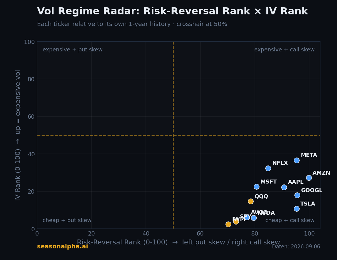
The chart shows twelve large US underlyings as of 6 September 2026 over a rolling year. Note that almost all sit in the lower half (IV rank below 40%) — implied volatility is near its yearly lows across the board. SPY, IWM and NVDA hug the bottom with IV rank under 6%. At the same time nearly all sit to the right (RR rank above 70%): call skew is unusually high relative to each name's own history, so puts are comparatively cheap. In radar terms, that is the "cheap vol, little downside hedging pressure" quadrant.
The four quadrants as an idea grid
The position in the radar maps to four broad option structures — as framing, not as a recommendation:
| Quadrant | Vol | Skew | Angle |
|---|---|---|---|
| Top right | expensive | call skew | sell call premium (call credit spread) |
| Top left | expensive | put skew | sell put premium (put credit spread) |
| Bottom right | cheap | call skew | buy upside (call debit spread) |
| Bottom left | cheap | put skew | buy downside (put debit spread) |
At the top you tend to sell premium (vol is expensive), at the bottom you buy it (vol is cheap). Left versus right tells you whether the structure sits on the put or call side. It is a starting grid for research — not a finished setup.
Rank and percentile side by side
The second chart shows the same twelve tickers, but with percentile instead of rank on both axes. The dots shift slightly — and that shift is what makes the difference tangible.
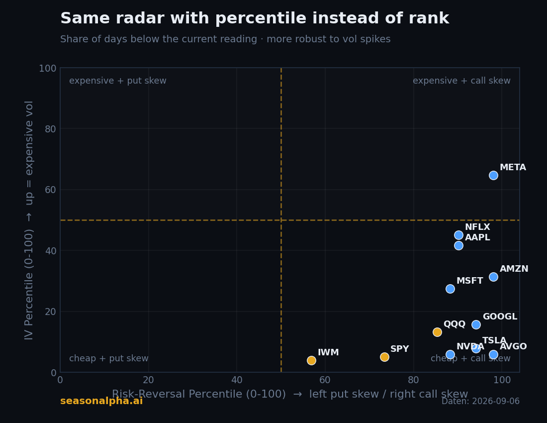
Three shifts stand out:
- META jumps from IV rank 37% to IV percentile 65% — crossing the crosshair into the upper half. Translation: within the range META sits mid-pack, but volatility was cheaper than today on almost two thirds of days. Percentile rates META "relatively expensive"; rank still calls it "middling".
- AAPL moves up from IV rank 22% to percentile 42%.
- AVGO shifts horizontally: its RR rank of 77% becomes an RR percentile of 98% — call skew was almost never this pronounced before.
These jumps appear when a single volatility or skew outlier inflates the range. Rank gets diluted, percentile stays closer to the typical day-to-day. Reading only one metric misses these cases. That is why the radar shows both and lets you switch the window (3M/6M/1Y/2Y) — shorter windows react faster, longer ones smooth more.
How to use the radar on SeasonAlpha
The full radar lives on /skew. It covers 156 US tickers across nine theme categories — from indices and mega caps through semiconductors to single momentum names. The window switch lets you compare short-term and long-term framing.
The practical flow: filter to a category, find the outliers in the corners, and check whether rank and percentile tell the same story. When they diverge, an outlier in the history is at play — a cue to look closer, not to trade blindly. Then combine it with the dealer positioning page to see where the hedging flows sit.
Limits
The radar is backward-looking context, not a look into the future. It tells you where IV and skew stand relative to their own past — not whether volatility is about to rise or fall.
- No trade signal. An expensive vol regime can stay expensive or get more so. Rank and percentile are framing, not triggers.
- Window-dependent. The same ticker looks different in a 3-month window than in a 2-year one. Compare deliberately.
- Data basis. We compute on 25-delta IVs from available option chains. That is a solid approximation of skew, not a tick-level surface.
Conclusion
The vol regime radar answers "expensive or cheap?" not in absolute terms but relative to a ticker's own history. Risk reversal shows the skew direction, IV rank the position in the range, IV percentile the frequency — and the gap between the last two flags when an outlier distorts the statistic.
Right now the market sits broadly in the cheap, call-heavy quadrant. Whether that is an opportunity or just a state is for your own plan to decide. See for yourself on seasonalpha.ai/skew.
FAQ
What is the difference between IV rank and IV percentile?
IV rank measures position in the range: (current − min) / (max − min). IV percentile measures frequency: the share of days on which volatility was lower. A single volatility spike drags rank down but barely touches percentile — which is why percentile is considered more robust.
What does a risk reversal mean?
A risk reversal is the IV of a 25-delta call minus the IV of a 25-delta put. If it is negative, puts are more expensive (put skew, hedging demand). If positive, calls are more expensive (call skew, upside speculation). It is the most common measure of volatility skew.
How do I read the vol regime radar?
The X axis is risk reversal rank (put skew left, call skew right), the Y axis is IV rank or IV percentile (expensive at the top, cheap at the bottom). The crosshair at 50% splits the chart into four quadrants. You tend to sell premium at the top and buy it at the bottom — as an idea grid, not a signal.
Is a high IV rank a buy signal for options?
No. A high IV rank only means implied volatility is near its yearly high — so options are relatively expensive, which argues against buying them. Rank says nothing about whether volatility will keep rising or fall. It is context, not a trigger.